Working with Color
Table of contents
Color is an important aspect of visual communication, and there is a lot of theory behind choosing colors. Color can be used for:
- contrasting different categorical groups
- distinguishing quantitative variables
- highlighting information
It’s really important to learn to use colors effectively.
Color Codes
In Base R, different graph elements can be set using the col parameter (also col.axis, col.lab, col.main, col.sub). Other packages include additional functions for controlling colors (e.g. fill in ggplot2).
There are several ways to refer to colors in R:
- name - e.g.
col="aquamarine4"(also “blue”, salmon”, “violet”, etc.)- use
colors()to see a list of the 657 named colors in R - see this blog for a graphical display
- use
- number - e.g.
col=1, or draw numbers fromcolors()[1:657]- all named colors can also be accessed by their index number
- RGB - e.g. rgb(red, green, blue, alpha), e.g.
rgb(0,0,255)= blue- amount of red, green, and blue, ranging from 0-255, plus transparency
- hexadecimal - “#RRGGBB”, e.g.
#0000FF= blue- each pair of digits from 00-FF corresponds to the intensity of red, green, or blue
- HCL - hue, chroma, luminescence - an alternative representation of color
Palettes
Palettes are groups of related colors that are used together to convey or highlight different kinds of information. A good discussion on palettes (and colors more generally) may be found here.
General categories of palettes are:
- sequential
- Great for low-to-high things where one extreme is exciting and the other is boring, like (transformations of) p-values and correlations (caveat: here I’m assuming the only exciting correlations you’re likely to see are positive, i.e. near 1).
- qualitative
- Great for non-ordered categorical things – such as your typical factor, like country or continent. Note the special case “Paired” palette; example where that’s useful: a non-experimental factor (e.g. type of wheat) and a binary experimental factor (e.g. untreated vs. treated).
- diverging
- Great for things that range from “extreme and negative” to “extreme and positive”, going through “non extreme and boring” along the way, such as t-statistics and z-scores and signed correlations.
- hybrid - combine qualitative and sequential aspects
Many different palettes are available in R for representing categorical or quantitative data. The current color palette in R can be accessed using palette(). The default one is not so nice, which is why it’s good to know about other options!
Since a palette is simply a vector of color codes in R, you can also define your own palettes by manually specifying a vector of color codes, but there are also a lot of R color packages that provide a range of different color palettes.
R Color Packages
Some color packages in R:
- grDevices (Base R)
- a built-in package that comes with a range of functions for defining palettes
- includes rainbow, heat.colors, cm.colors
- colorspace - hcl colors, now implemented in grDevices as
hcl.color() - RColorBrewer - provides nice set of palettes for different display purposes
- after installing, palettes can be accessed using
display.brewer.all()
- after installing, palettes can be accessed using
- viridis - robust color scales for colorblindness
- ggsci - scientific journal color palettes
- unikn - color schemes of the University of Konstanz (used in the Neth book below)
- wesanderson - 16 palettes from Wes Anderson movies (!)
Color Blindness
Color blindness is the decreased ability to see differences in color. It affects many people, and red-green blindness is the most widespread form. To make sure that your graphs are as widely accessible as possible (one of your reviewers may be color-blind, too), there are two things you can do:
- Choose colors that can be distinguished by the majority of color-blind people.
- Use other ways to make data points visually distinct - e.g. point shape, point size, add text labels or arrows pointing at important elements.
When choosing colors that are friendly to color-blind people, you may do one of the following (arranged from lowest to largest amount of effort required):
- Whenever possible, simply avoid using red and green together.
- Try using different shades of different colors. For example, light green and dark red can be better distinguished than green and red of the same shade.
- Stick to one favorite color palette that you know works well for the color-blind and always use it. For example, you could use
viridis(see above) for continuous data or this palette developed by Masataka Okabe and Kei Ito for categorical data.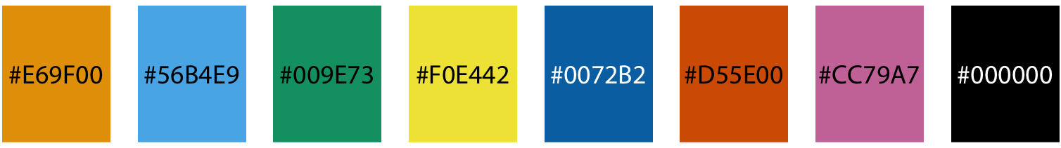
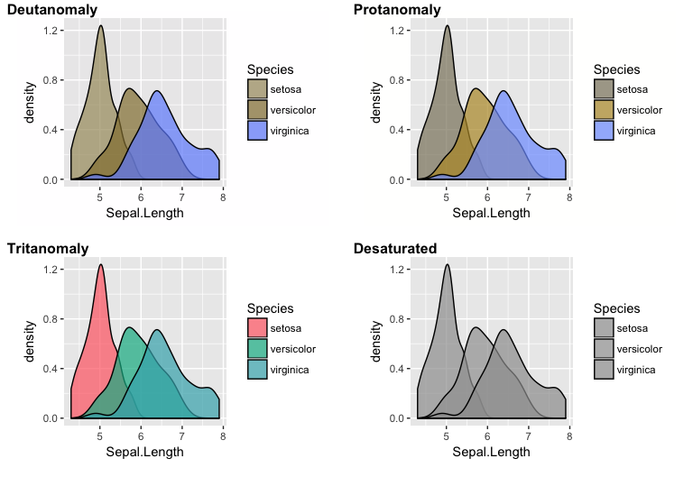
- Simulate color blindness and keep adjusting the colors you use until they can be distinguished in simulated plots. colorblindr is an example of a package that can very easily simulate how ggplot2 plots look for color-blind people. The code would be as simple as this:
library(ggplot2)
library(colorblindr)

# create a ggplot
fig <- ggplot(iris, aes(Sepal.Length, fill = Species)) + geom_density(alpha = 0.7)
# generate four basic color-vision-deficiency simulations for the ggplot
cvd_grid(fig)
Color Resources
- Data Science for Psychologists: Appendix D - Hansjörg Neth (2021-09-03)
- A good discussion about colors, palettes, and R color packages
- R Graph Gallery
- STDHA
- The Elements of Choosing Colors for Great Data Visualization in R
- Introduces another tool for designing color palettes called colortools
- The Elements of Choosing Colors for Great Data Visualization in R
- [R Cookbook: colors with ggplot2 (includes RColorBrewer)**](http://www.cookbook-r.com/Graphs/Colors_(ggplot2){: target=”blank”}
- Tidyverse: RColorBrewer with ggplot2**
- Comprehensive list of color palettes in R
- also provides a link to an interactive color picker